Best practices for launching 3D and AR for ecommerce

Adding product visualization, 3D configurators, and augmented reality is a great step in driving a brand to the top of the industry. To make sure you are deriving all possible value form your 3D assets, be sure to follow these best practices as you implement your 3D experience.
Visibility: Put your 3D product in the spotlight
3D drives revenue by boosting engagement time with products and increasing add to cart and conversion rates. To make sure 3D has this impact on your experience, place 3D where users will see it or where they would naturally interact.
On Product Pages
Place the 3D product on the product page in the details section. Placing 3D section high on the page and full-width gives customers a feeling of quality and engagement with your product.

3D in Image Carousels
If you have an image carousel or slider on your product's page already, it may be tempting to drop your 3D product directly in. However, this can cause UX and performance issues if not done properly. Here's what you need to know:
-
Put your 3D product as the first slide (or as close to the first slide as possible) to get the most engagement, since user engagement tends to fall off extremely quickly after the first slide.
-
Have an extra way for users to navigate to other slides besides swiping, such as with arrows on each slide or clickable thumbnails below the carousel, since touch users (especially mobile shoppers) could get "stuck" as their swiping motion only rotates the 3D product instead of navigating the slides.
-
If your carousel is dynamic and updates each image when a new option is selected for your product, such as changing its color, then be sure that the slide with your 3D product does not get recreated each time too. Instead, make sure your carousel only replaces the other images in each slide but leaves the 3D canvas untouched, so that the 3D product can simply be updated without having to reload the entire 3D scene again.
-
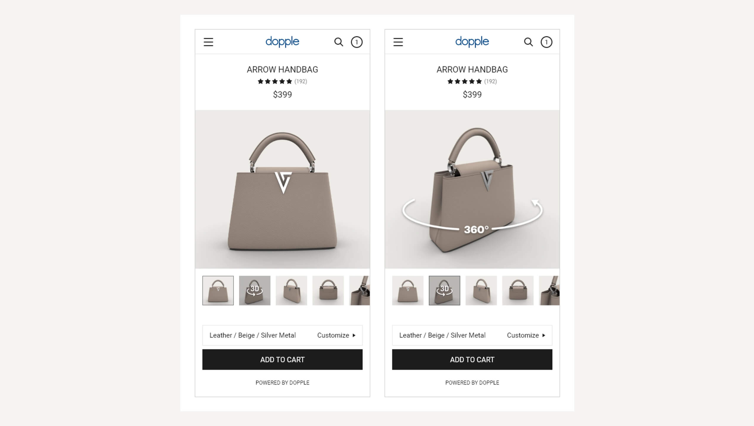
Show an indication in your UI (such as using a "3D" or "360°" icon, or "Drag to rotate" text) that the 3D product in your carousel is interactive and not just a static image or video like the other slides.
As a general rule of thumb, your 3D product visualizers/configurators will see much more usage and interaction if placed outside of the carousel in their own space on the page!

Engagement: encourage users to interact
Make it clear to users that this is not just a photo:
-
Loading image: Display an image during the loading time with an indication that the 3D is loading, so users see your product the whole time.
-
Rotation: When the 3D window is visible to the user, make the product rotate into place. The rotation should stop after a period of time or after the user interacts with the product.
-
3D / 360° & rotation icons: Make use of 360° iconography (like in thumbnails) or in UI over the canvas itself.
-
Product angle: Display the product at an angle so it stands out from 2D product images.
-
Cursor: Show a “grab” cursor when mouse hovers over the 3D area.
-
Headline: If placing 3D configuration in a section on the product page, label the 3D section at the top.
-
AR: provide an AR option for users to see the end result of their configured product, in their space.

Configuration UI Best Practices
The power of a configurator experience is to enable the user to play and feel like, “I made this mine!”
Configuration Visibility
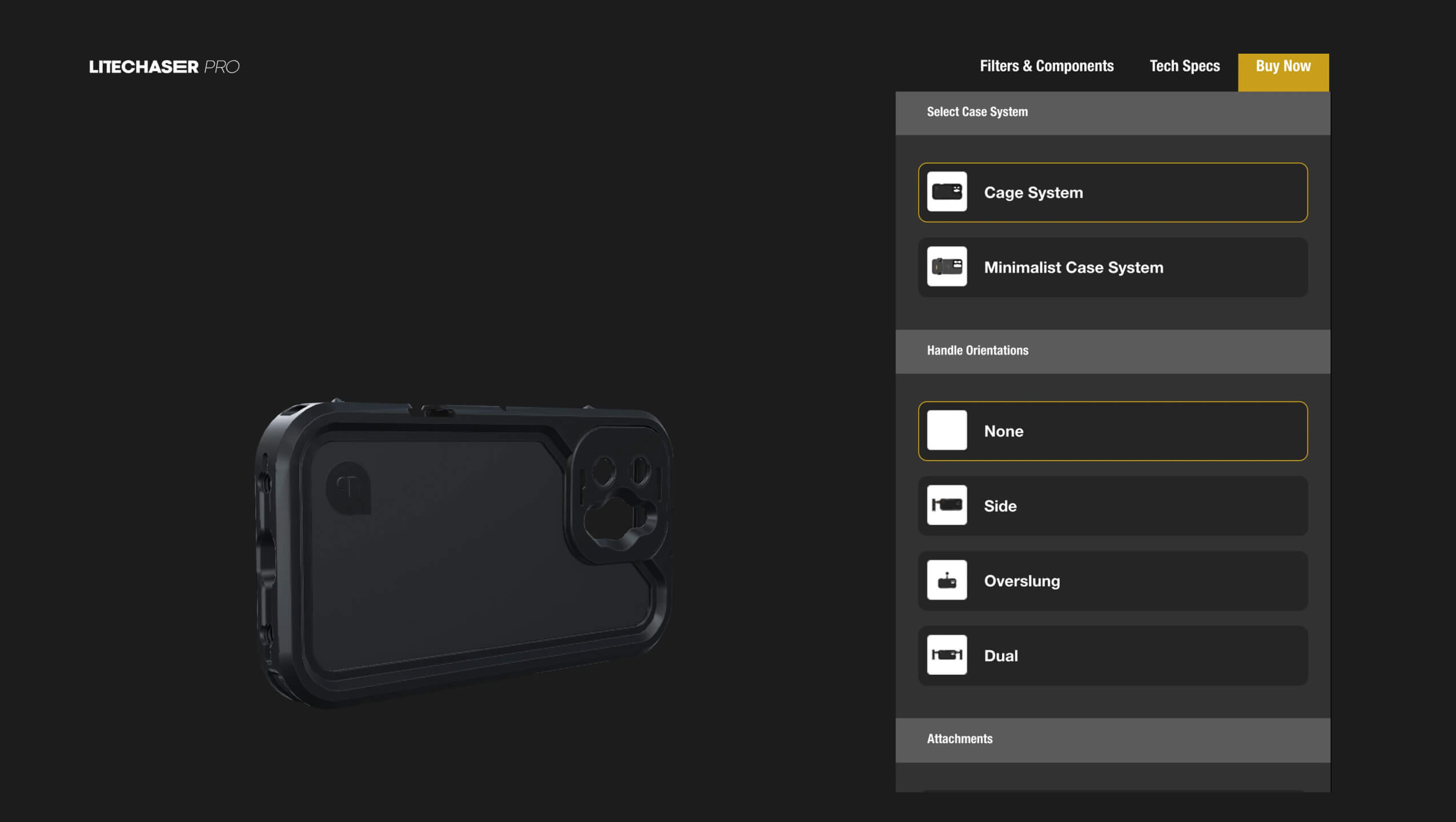
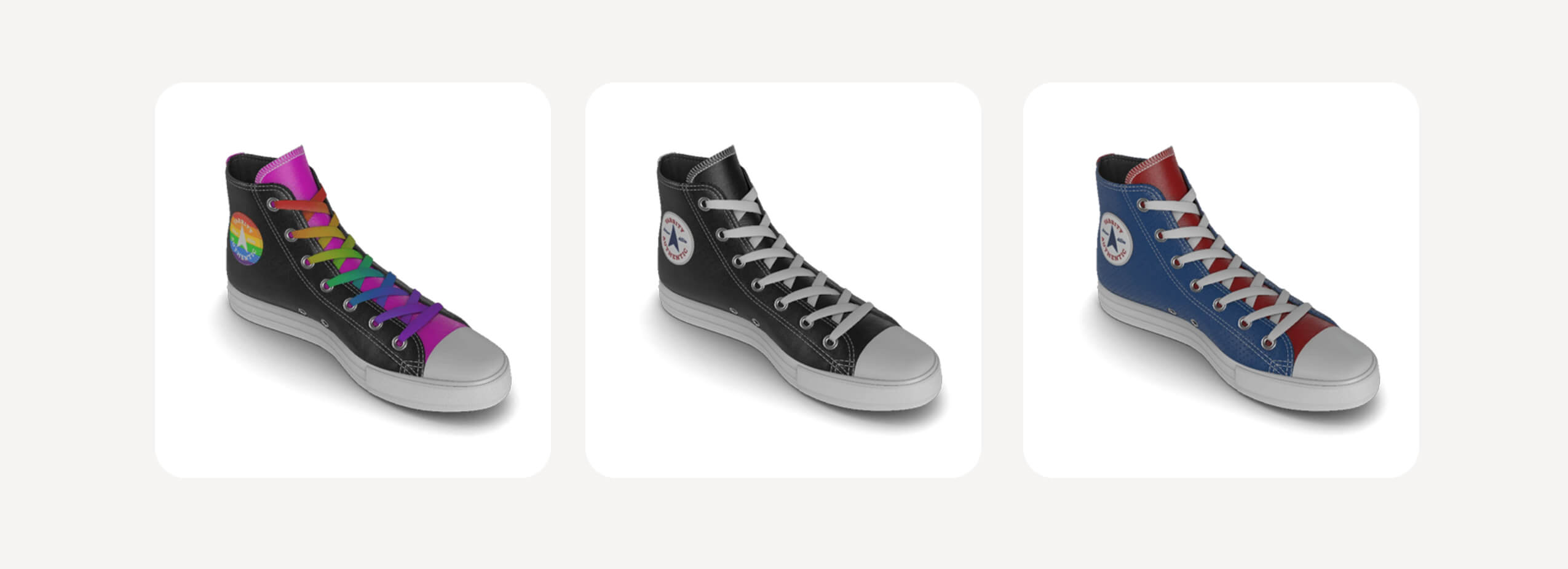
For configuration, make sure customers can see the 3D model changing on the screen as they make selections - both on mobile and on desktop devices.
-
Example: Dopple’s sneaker on mobile fits both 3D and choices on the screen.
-
Add tooltips to your UI to guide new users on how to use your configurator tool
-
Make the currently selected option very obvious (e.g. use an outline and/or a checkbox over the swatch)
-
Also show/indicate the name of the options, as well as the currently selected option (e.g. with paint colors or lipsticks, users might be searching based on the name).
-
Add tooltips over options with titles/info.
-
-
If 3D or AR are still loading, don’t hide them; just gray them out or disable them
Use existing tools (Dopple Visual Component)
Save development time by using Dopple’s Visual Component. Benefits include:
-
Initializes Dopple Visual and loads your 3D product with zero manual JavaScript.
-
Automatically displays a loading screen while your 3D product loads.
-
Binds buttons/elements in your UI to easily update your 3D product's configuration, instead of having to manually make calls to Dopple's API for each change (see the DOM binding).
-
Creates View in AR, View in Fullscreen, and Take Snapshot options for you with only one extra line of HTML for each (zero JS to write and manually setup).
-
Still gives you full access to Dopple's API for more nuanced control of your 3D product and scene.
-
Shows a "grab" cursor when mouse users hover over the canvas.
-
Applies the necessary CSS to the canvas to prevent unwanted scrolling on touch devices (like smartphones).
Measure Results
Plan for tracking and analytics to measure your success:
-
Plan your key performance indicators and discuss with your partners. These often include a target interaction rate (impacted by placement), increase in engagement time, increase in add to cart, increase in average lead referrals per session.
-
Use Dopple’s out of the box measurements (session tracking, analytics).
-
Plan for a Call to Action in the experience so customers know what to do. For ecommerce, this is usually an add to cart but could include “where to buy” or “learn more”. For sales team tools and trade show experiences, this could include collecting a prospect’s contact info.
-
Plan for setup of add to cart, alternative conversions, AR tracking: these are custom to your experience, so they should be set up during integration. You can track multiple conversion events.
Full analytics information is available in the Dopple documentation.
The Dopple team is here to guide you as you bring unforgettable 3D product configuration and AR experiences to your ecommerce!